Forum

> > Projects > Stranded III Dev. Blog
Forums overviewProjects overviewLog in to reply

English Stranded III Dev. Blog

115 replies
Page
To the start Previous 1 2 3 4 5 6 Next To the start

old Tortoise / Toucan / UI

DC
Admin Off Offline

Quote
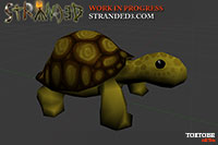
Tortoise
I made a tortoise model!
> Watch Tortoise modelling @ YouTube

There's also a (work in progress) texture already:
IMG:https://stuff.unrealsoftware.de/pics/s3dev/models/tortoise_pre.jpg


Stranded I had a turtle (water), Stranded II a tortoise (land). The plan is to have BOTH in Stranded III! INSANITY!


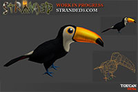
Toucan
While searching for animals living in tropical rainforests I came across the Toucan. So I made one for the game.
IMG:https://stuff.unrealsoftware.de/pics/s3dev/models/toucan_pre.jpg


Actually the list I found contains a lot of nice animals and I'll certainly add some more of those.
I mean.. a poison dart frog?! Imagine catching frogs in order to make poison darts! Awesome!

Even More UI Stuff
I re-created a lot more required missing UI components:

Slider
Sliders can be used for settings with small value ranges...
IMG:https://stuff.unrealsoftware.de/pics/s3dev/ui/slider_few_values.gif


...but also for settings with quite high ranges:
IMG:https://stuff.unrealsoftware.de/pics/s3dev/ui/slider_many_values.gif

Note that the amount of these little vertical bars adjusts automatically depending on the value range but the maximum is capped at 10 (even amount) / 11 (odd amount). Otherwise I would have to display 101 (0-100) of them in the slider above. That wouldn't be very helpful and it would also look stupid.

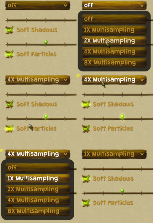
Combobox
Useful when you need to see all possible options at once (yup, the image below is a horrible example!)
IMG:https://stuff.unrealsoftware.de/pics/s3dev/ui/combobox.gif


Moreover there are now context menus and tooltips!
The combobox mentioned above uses the context menu system internally. In fact it's a simple button which opens a context menu on click and when you press any button in that context menu, the button caption/value is changed to match the clicked entry.
Context menus also support scrolling (in case there are too many entries to fit the screen) and sub menus.
Sub menus are context menu entries with a little arrow which open an additional context menu with new entries when you point at them. Context menus can be nested indefinitely in theory. A sub menu could contain another sub menu and so on. Might be useful for the map editor. Maybe. I don't know yet.
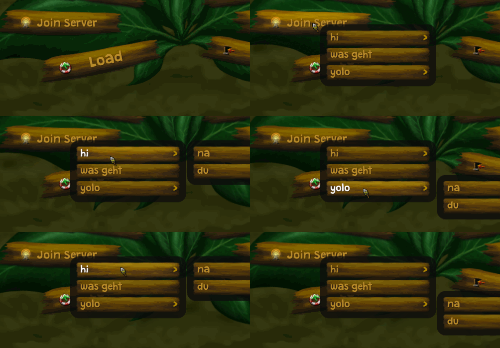
IMG:https://stuff.unrealsoftware.de/pics/s3dev/ui/context.gif


(Reminder in case you read all blog entries carefully: Yes, all that fancy UI stuff existed already. It was completely implemented in Lua with a custom Unity 2D system. Now it's using C# and Unity UI!)
edited 3×, last 04.11.18 07:12:19 pm

old Bars & Palm Trees

DC
Admin Off Offline

Quote
Health, Hunger, Thirst
I tried many different things to display values like health, hunger and thirst.
Circles, crazy shapes, vertical bars, horizontal bars, numbers...

What did I end up with?
Boring standard bars:
IMG:https://stuff.unrealsoftware.de/pics/s3dev/ui/hud_thh.jpg


Why so?
There are three reasons:
1. Style: I simply didn't like the look of the other options
2. Consistency: It was like that in Stranded I and II
3. Simplicity: Nearly everybody who ever played a game knows the concept of a health bar. Also probably everybody using a PC knows the concept of a progress bar. So I hope that most people understand quickly how that stuff works.

Boring, right? But hey, it's not thaaaat bad! The bars have a fancy icon and an animated glow effect (fun fact: I use a lot of that glow stuff in my game Carnage Contest - an amazing Worms clone! Check it out!)! So they are still better than the ones in Stranded I and II
The icons are just the first iteration by the way. I may decide to change them later.

Sleeping Issues
Experienced Stranded players may now ask: Health, hunger and thirst. Cool, I know that stuff. But what about fatigue aka tiredness?
Well... I'm really sorry to tell you that but it's gone. Again there are multiple reasons:

1. The concept of sleeping (and not being able to do anything for a long period of time) doesn't work well in multiplayer mode
2. Fatigue did not add much value to the game. It limited you a bit in what you can do per day (as there was no efficient way to get rid of tiredness except for sleeping) but in most cases you just slept every night and you were fine.

Sleeping itself won't be removed completely though.

In singleplayer you can still do it to skip the dark night hours.
Depending on the spot you sleep at (house, fire place...) sleeping can also give you some positive or negative effects (e.g. affect health a bit).
If you decide NOT to sleep for a longer time you will suffer from some negative effects like decreased speed and effectiveness.

In multiplayer you won't have to sleep at all and the person hosting the game will even be able to adjust the day/night cycle with a simple setting so people don't have to play in darkness for long or at all (this really only affects the sun light. It does not make the time go faster or anything).
Maybe I will still allow sleeping though. If I do so you will probably be able to rest for a short time. The game will go on normally during that time and you are vulnerable to attacks and theft but you would also get something in return. That might be some health points or a temporary boost on some values/skills.

More bars
Additionally there can be two bars which will only be displayed when they aren't full: Oxygen and stamina.

Oxygen will be displayed when you're diving. That was also part of Stranded II but the bar popped up in the middle of the screen there. It automatically refills when you can breath again. Another fun fact: It wasn't possible to dive at all in Stranded I! Even the ocean was just shallow water you could wade through. An invisible force pushed you back when you walked too far. Crazy stuff!

Stamina is for running. Yes, you will finally be able to run! Only for a short time and it will be more expensive than going the normal speed (hunger and thirst will be depleted faster) but it might save your life in some situations. Stamina automatically regenerates when you stop running.
I didn't make a final decision about this yet but maybe Stamina will also affect some other actions and/or blocking/fighting. This might be too annoying though. I still have to test and balance this.

IMG:https://stuff.unrealsoftware.de/pics/s3dev/ui/hud_o2power.jpg


Stamina and oxygen could be affected by skills/perks and of course also by consumable items or the equipment your character is wearing. I didn't add items for that yet but it would be cool to have something like that in the game.

Palm Trees
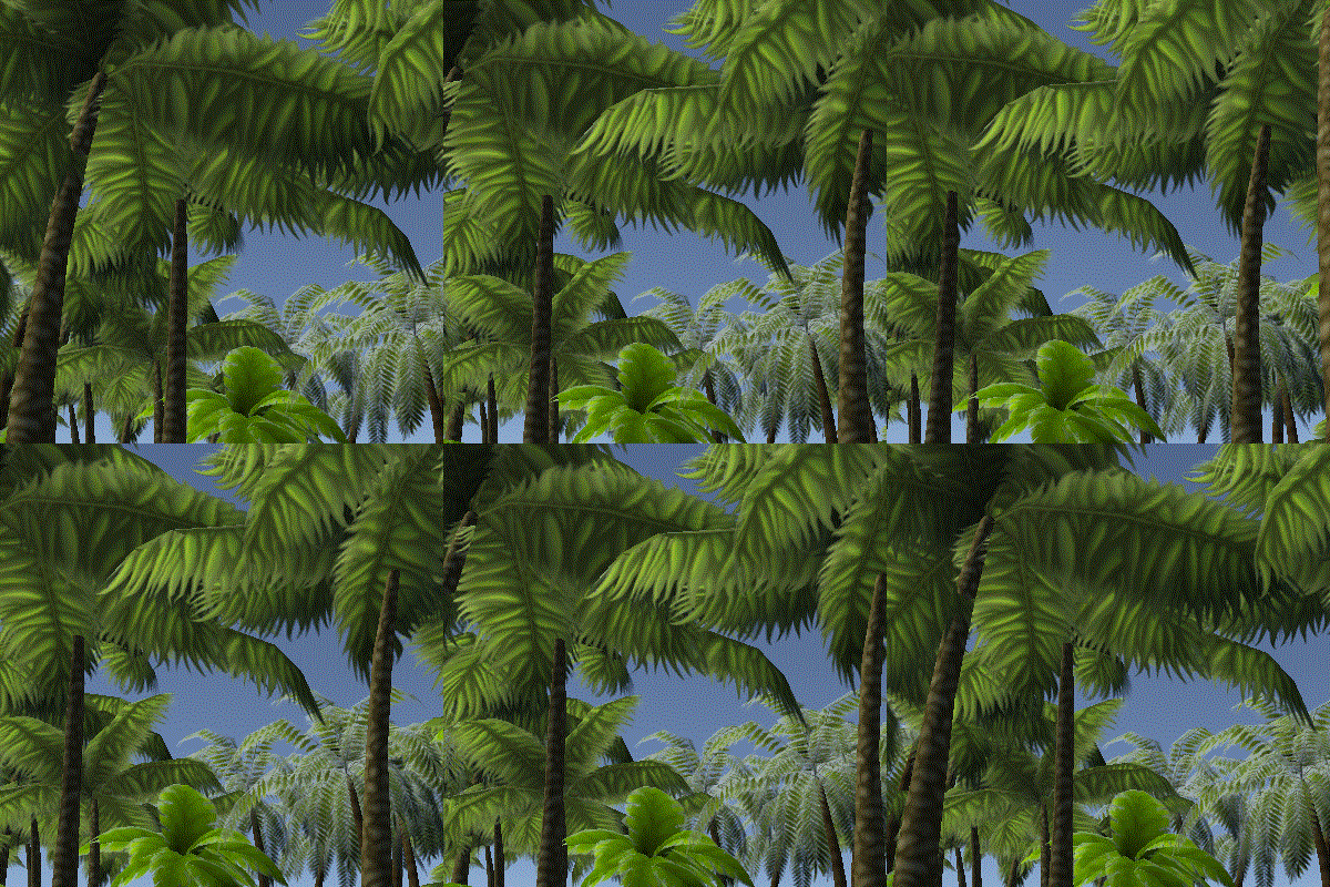
I love palm trees. I think they are beautiful and they remind me of warm temperatures and vacation because you don't see them in nature where I live (in Hamburg, Germany). The problem is that there are sooo many variants! Whenever I see a palm tree assets somewhere (e.g. in other games) I take a closer look and when I like them I decide to make something similar for Stranded III.
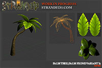
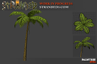
This is why I just made another version of the palm tree. Basically new hand-painted palm fronds. the trunk is the same as before.
IMG:https://stuff.unrealsoftware.de/pics/s3dev/models/palmtree_3_pre.jpg


For comparison: This is one of the other versions I made earlier
IMG:https://stuff.unrealsoftware.de/pics/s3dev/models/palmtree_b_pre.jpg


What about iterative development?
Some people might remember that beginning of this year I planned to switch to a more iterative development approach (entry 76). I didn't want to only keep adding random models to a totally unfinished game. I even set a deadline for a basic multiplayer alpha. End of this year.

It's December now. Only a few more days are left for this year and you see me still posting random models instead of showing game play. I didn't manage to do what I planned to do. No multiplayer alpha.

No multiplayer alpha yet.
I decided to pretend that there never was that virtual deadline. I'll continue with development because that's what I want to do.

old Island Generation Improvements

DC
Admin Off Offline

Quote
Random Island Generation Improvements
A long time ago a blogged about random island generation. Here are some of my old blog entries about the topic:
> Random Terrain Generator
> Terrain Generator Continued
> Rivers
> More About Rivers
> Voronoi Powered Rivers, Bezier

I used a complex Voronoi/Delauny library for this and then rasterized the data using a polygon fill algorithm because I need a 2D pixel array for the heightmap.
After doing some more research however I realized that generating a Voronoi diagram directly as a 2D array is quite easy. I even found a site with minimalist Delauny diagram implementations for various programming languages.
No C# implementation there but the approach is so simple that it only took a few minutes to write a working version for Unity in C#. The only problem with the approach presented there (I only looked at the Java version) is that the algorithm is not optmized at all and gets a lot slower with increasing numbers of Voronoi sites.

What it does is extremely simple:
• for each pixel in the array:
     • find the closest Voronoi site by iterating over all sites and saving the shortest one with distance
     • tint the pixel in the color of the site with the shortest distance

There are two problems with the implementation:
• Checking the distance to ALL voronoi sites for each pixel: This makes the algorithm super slow with increasing numbers of sites. The solution for this is to only check the distance of adjacent sites. I'm creating the site points in a grid pattern so I know all the neighbors. This makes it easy to implement this optimization.
• Square root calculation in distance calculation: Calculating a square root is a relatively expensive operation. This operation can simply be removed because we only compare distances and don't need the actual distance. This has no huge impact but still makes a difference.

I solved both of these problems and achieved a fair performance that way.
The best thing however is that this approach is so much easier and requires just like 1% of the amount of code that I had before.

To test my new implementation more easily I made a little separate Unity project which you can try in the browser:
> Try the Web Map Generator
Note that this is just a very basic version which only creates a basic island shape and assigns some random colors. Also it doesn't work perfectly well with non-square map sizes.

Further Optimizations
Another thing I'll change is the resolution I'm using for the random map generation.
I was insane enough to work with a 1x1 m precision for all operations. Now I plan to reduced the base resolution to 4x4 m or maybe even 8x8 m.
Imagine a 256x256 m island. With the current calculation this leads to 256x256 "pixels" which is 65.536 pieces of data (each representing 1x1 m).
With 4x4 m precison the values change a bit: 256 / 4 is 64. 64x64 results in only 4.096 pieces of data. That's only 6.25% of the original data and therefore allows a much faster world generation. With 8x8 m it would be only 1.024 pieces of data.

Of course simply doing just that would make the generated maps blocky and ugly. That's why I will switch back to the 1x1 m precision after generating the basic map layout. I'll then apply simple smoothing algorithms and perlin noise to get more detailed and non-blocky results.


Red Cross
Someone in the comments pointed out that the red cross can be problematic in video games and he's totally right about it.
Therefore I replaced the red cross with a heart - which is a better logo anyway
edited 1×, last 13.01.19 11:36:27 pm

old Banana Plant & Palisade

DC
Admin Off Offline

Quote
Oops! Exactly 90 days without a dev blog post! I'm still alive!

Nested Prefabs
Basically everyone working with Unity for some time already has been waiting way too long for nested prefabs. Some Unity updates ago this feature has finally been released in a "stable" (non beta) version of Unity.
For Stranded III they are especially useful for UI. I can now make one single slider prefab for instance and re-use it everywhere. When I think the slider looks ugly I can just change the prefab and all sliders in all menus will be changed accordingly.
This did not work with earlier versions because the menus themselves already needed to be prefabs and Unity did not allow to put prefabs into prefabs (in other words: It did not allow to nest prefabs).

To benefit from this change I had to replace all non-prefab objects with prefabs. Some manually and others with the help of some scripts I wrote. This procedure wasn't a lot of fun but now it's done.

Banana Plant
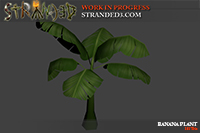
I made a banana plant with hand painted leaves!
Bananas can just be picked and eaten when they are ripe. This makes them an easily accessible food source. Useful for survivors which are not well equipped yet.
IMG:https://stuff.unrealsoftware.de/pics/s3dev/models/bananaplant_pre.jpg

> View Banana Plant on Sketchfab

Palisade
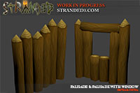
Moreover there's a palisade now. I just modified and copy & pasted the log model to make this one.
Even though there is a version with a window the palisade is only meant to be used as a protection for your camp and not as a wall for buildings.
IMG:https://stuff.unrealsoftware.de/pics/s3dev/models/palisade_pre.jpg


I plan however to add some more log based building blocks. Some ideas*:
• a gate which can be opened and closed (like in Stranded II)
• ... and maybe a way to close the window in the palisade as well?!
• a wall walk which can be built behind palisades and other walls
• various different parts to build a log house, tree house, towers etc.
• a jetty (yes, again like in Stranded II)

*) Just ideas. I don't promise that all of them will make it into the game.

Cool Links
I found a very nice guide in case you're interested in stylized 3D modelling.
It contains a ton of advices and common mistakes that should be avoided.
> Stylized 3D Production Guide

There are also many other interesting and useful game dev articles on 80.lv!
So if you're interested in this topic you should definitely take a look!

old Update Madness & Stacking

DC
Admin Off Offline

Quote
Unity 2019 & Lightweight Render Pipeline
Sooo... I upgraded from Unity 2018 to the lately released Unity 2019 and of course all my materials looked and behaved differently afterwards. Fun.
I took that as an opportunity to also switch to the Lightweight Render Pipeline! Maybe it makes rendering a bit faster!?
This step of course resulted in... more broken stuff.
I had to fix most materials manually. There's an "automatic" conversion but it didn't do a good job even though I only used original materials provided by Unity. More fun.
Afterwards I noticed that the LWRP (Lightweight Render Pipeline) isn't good at z-sorting alpha stuff:
IMG:https://stuff.unrealsoftware.de/pics/s3dev/landscape/zfight.gif


I have to admit though that the LWRP makes the game look much more like Stranded II (which had comparable z-fighting issues)
What you can't see in that Gif is that the terrain material exploded as well which made the entire terrain become invisible.

Another issue I experienced: OnPostRender doesn't work anymore with LWRP (or in fact any scripted render pipeline).
That's not even mentioned in the OnPostRender documentation though. Thanks Unity!
This broke my little real time debug stuff rendering library (I'm using Unity's low level graphics API for that).
I found out how to fix this but it requires some more changes.

Overall this is a massively frustrating experience and I wish back the good old days of Blitz3D - the engine I used for Stranded I and II.
Blitz3D was very limited but straightforward. The API was super simple, super clean and things just worked the way you expected them to work.
All that isn't true for Unity. They shove in tons of new stuff with every update. It feels like they have thousands of different systems for everything you want to do and none of them works flawlessly or is documented properly.

Come on Unity! Stop adding new stuff and making feature breaking changes and start fixing and documenting the existing stuff you have.
You are forcing developers (who want to stay up to date) to waste huge amounts of time with migrating to new systems. That's time they should spend working on gameplay and content.
I'm already very afraid of the new input system and the next entirely new UI system. This is going to be a huge mess!

Maybe I should stick to making 2D games or give Godot a try.

Stacking
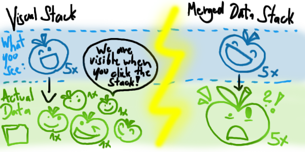
Item stacking is nearly as much fun as updating Unity. Earlier I decided that "real" item stacking (merging equal items and just giving them a count value) is too complicated. Instead there should only be visual stacking which would mean that items are displayed as stacks but when you click at a stack you see all of the individual items with their attributes.
IMG:https://stuff.unrealsoftware.de/pics/s3dev/stacking/visual_vs_merged.png

(missed a "1x" there but you get the idea)

Visual-only-stacks are cool and maybe I will keep this in the game but there's a technical problem with this: Tiny items that you get in big numbers and which all have equal attributes. Think of ammunition.
These would consume a lot of memory and take a lot of network traffic to sync. It's only a theoretical problem at this point but it feels horribly wasteful and I don't want to handle things that way.
My old "solution" to this was to simply declare that all items are very precious in Stranded III and that it rarely happens that you have a big amount of the same item type.
This is not a real solution at all and it limits the game a lot.

So I thought about stacking again and came up with something.
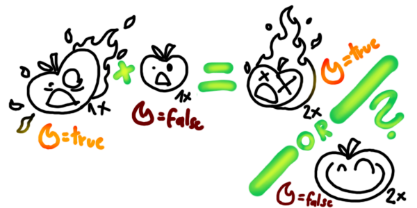
Stacking entirely equal items is relatively trivial. But how to handle items which have different attributes? E.g. one item burns and the other one doesn't. Should both be stacked and then both burn? Or none burns? Or they can't be stacked because the fire makes them different?
IMG:https://stuff.unrealsoftware.de/pics/s3dev/stacking/merge_attributes.png


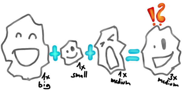
Or what about sizes and weights? Can 3 rocks with different sizes become a single rock stack with a little counter saying it is actually 3? Should they get the average size then? Wouldn't that allow people to modify items by letting them stack in smart ways?
IMG:https://stuff.unrealsoftware.de/pics/s3dev/stacking/merge_sizes.png


For most cases the answer is: If items have different attributes they can't be stacked. The attributes are different for reasons and should stay the way they are.
In some cases however an attribute might not be important for inventory items at all. We could just remove it or take the minimum/maximum/average to allow stacking anyway.
For example an internal attribute which is used to store a state which is only relevant for items outside your inventory. This shouldn't prevent stacking.

Because of this you will be able to define different crazy merging strategies for each attribute:
• The default behavior will be that stacking won't work if the stack candidates have different values for an attribute.
• You could also just tell the game to remove the attribute during stacking (ignoring the values)
• Or tell it to not stack at all as soon as the attribute is present on at least one stack candidate (ignoring the values as well)
• And if you're completely crazy you keep the attribute but you calculate the minimum/maximum/average value across all stack candidates
• Aaand if you think the previous thing wasn't insane enough you could also let people implement methods in Lua to allow them handling the stacking logic their own way

Whenever a new item is stored somewhere (e.g. in your inventory) Stranded III will run a pairwise check for all items of that type and try to stack them by checking all their attributes and the merging strategies of these attributes.
When stacks are found the new attribute values for each stack are calculated. Depending on the merging strategy attributes can be discarded or recalculated based on attributes of the related stack candidates. Rocket science!
edited 4×, last 22.05.19 11:28:23 pm

old Goodbye LWRP, Welcome CREST

DC
Admin Off Offline

Quote
Goodbye LWRP
I wrote about problems with the Leightweight Render Pipeline (LWRP) in the last post and decided to not use it as it's causing too many issues.
It just doesn't look finished too me and things aren't documented sufficiently. Certainly good enough for smaller projects or when starting new projects but migration with a larger project is just too painful.

Goodbye Untiy Terrain
I dislike working with Unity terrain because of Unity's weird way of dealing with coordinates. Moreover I dislike the way it's textured and the terrain trees also don't work like I want them to work.
They may have improved rendering performance a lot but I still don't feel comfortable when working with it.
Therefore I went back to creating my own mesh terrain. It's more flexible, I have more freedom and I can do more crazy stuff.
I'm also working on my own shaders and experimenting with different approaches to texture the terrain surface. Right now I'm using just a grayscale detail texture which is colored via vertex colors. I may allow different textures based on color values or use the normals to display rock textures on steep terrain areas. So many possibilities. I'm still trying to find the best solution.

Welcome CREST
Beautiful water is a cool thing and there are tons of water assets in the Unity Asset store.
I searched for a free light weight open source solution and found CREST which simply looks amazing!
It's actively maintained and fully open source! Also the setup is very simple!
Fun fact: There's a paid version for the LWRP - luckily I just discarded my plans to use LWRP...

More Random Terrain Improvements
I worked on improving random terrain generation.

Additional smoothing on area edges makes big differences in height between areas look better
IMG:https://stuff.unrealsoftware.de/pics/s3dev/mapgen/heightmap_area_edge_smooth_pre.png


Shallow sea areas are placed next to most land areas. I also reduced the average sea depth. Both of these changes make beaches more interesting and less steep.
IMG:https://stuff.unrealsoftware.de/pics/s3dev/mapgen/heightmap_improved_pre.png


You can still see the voronoi areas quite clearly when viewing at this colored map version but it's not easily noticeable in the actual 3D game world.
Some additional noise could easily make it look more natural but I'm already quite happy with the results.

Art Inspiration
I look a lot at other games for reference and to get new ideas but also when I create new models and textures.
Here are some of my most favorite "Stranded III art reference games":

• Sea of Thieves
I love the art style and there are beautiful islands. Exactly what I need. Art book video.

• Blazing Sails
This looks a lot like a Sea of Thieves clone but it's "more indie". I like the simple art of this one as well. It's not as polished as the art in Sea of Thieves but realistically seen this makes it a great reference for me as a single developer because I can learn from them how to achieve a nice look with minimal manpower.

• World of Warcraft (and other Blizzard titles)
Some truly amazing artist are working at Blizzard and I like the low poly models with high quality hand-painted textures a lot. Since I'm doing the same (relatively low poly + hand-painted textures) World of Warcraft is a great references for me.

Do you know other games which look amazing and have a comparable art style? Let me know in the comments!

old Terrain LOD, Human, Grass

DC
Admin Off Offline

Quote
Mesh Terrain Performance
As mentioned previously I built my own mesh terrain!
Here are some cool links which helped me with that:

• Creating a grid mesh in Unity: https://catlikecoding.com/unity/tutorials/procedural-grid/
• Height calculation: https://ahbejarano.gitbook.io/lwjglgamedev/chapter15 (I boldly stole the method interpolateHeight from there so I didn't have to do the math on my own)

I improved the mesh terrain startup performance by generating the terrain meshes with a delay. So instead of just baking all meshes for all chunks at once on startup I create them in the background while the game is running. This is done with delays to avoid noticeable frame rate drops. Of course the meshes close to the player are created first and the game only starts when the closest meshes are generated.

Chunks very far away from the player are not baked at all until the player comes closer.

Minecraft (and many other games) work the same way. This is why you see terrain parts popping up out of nowhere. Of course it's more beautiful if you hide that effect. Either by building enough terrain chunks before the game starts or by using fog or blur to make it less apparent. I still have to figure out what works best for Stranded III. Probably a combination of both.

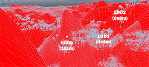
I also created a very simple level of detail (LOD) system for my mesh terrain. Instead of 1 mesh per chunk there are actually 3:
• LOD0: mesh grid with 1x1 meter sized cells
• LOD1: mesh grid with 4x4 meter sized cells
• LOD2: mesh grid with 8x8 meter sized cells

So depending on the camera/player distance I show LOD0 (close), LOD1 or LOD2 (far away). Of course the delayed mesh creation explained above also takes the required LOD level into account and creates the related mesh first.

IMG:https://stuff.unrealsoftware.de/pics/s3dev/terrain/lod_pre.jpg

(click for larger version)


A nasty problem when using different LOD levels for terrain chunks are the edges of the chunks. Because of the different LOD levels it is not easily possible to make them fit perfectly together. This can result in ugly holes between the edges.

One solution is to generate the edge areas of a chunk with the precision of the neighbor so they fit togther. But there are two problems with that:
× Expensive: More mesh baking is required because changing the LOD of one chunk also affects its neighbors. You would either have to save a lot of edge combinations or create new meshes more frequently (either more memory- or more CPU cost)
× Complicated: The required mesh geometry is more complex and pretty difficult/annoying to create in code.

When thinking about a better solution I remembered the terrain system I used with Ogre. It uses a dead simple solution: A mesh strip on the edges which just goes down vertically. That strip simply covers all possible gaps and holes!
You can see the wire frame of it in this video.
I implemented that solution for Stranded III as well.
√ Cheap: No additional mesh baking / LOD mesh variants with different edges.
√ Simple: Creating that additional strip geometry in code is quite easy
× Wasted render time: Most of the strip geometry is never visible and therefore rendered for no reason. Luckily the strips are quite small in comparison to the rest of the chunks so this is an acceptable drawback

Human Model
Making animal models is tough in my opinion but making humans is even harder. We all are surrounded by humans all the time and we know very well what a human is supposed to look like.
Therefore even the smallest anatomical inaccuracy is recognized. Sometimes you can't tell exactly what's wrong - it just looks weird.
Like with animals I'm going for a low poly and stylized approach. While this makes the process a bit easier the rough body proportions and anatomy still need to be right. Otherwise it looks odd.
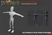
I found a nice low poly mal human model on Sketchfab which I'm using as reference.

And this is my progress so far:
IMG:https://stuff.unrealsoftware.de/pics/s3dev/models/male_human_t_wip_pre.jpg

(click for larger version)

Like the picture says: This is work in progress. Facial details are missing for reasons. More on that later

Grass
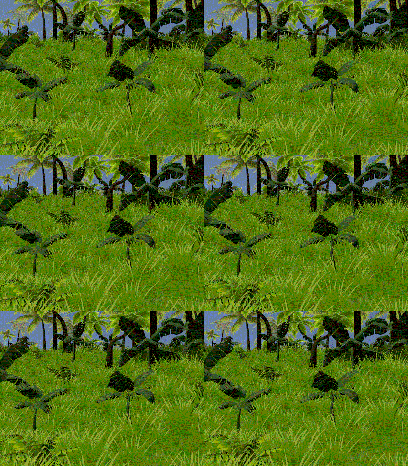
I added grass to my mesh terrain. I'm using Unity's instanced mesh drawing for that.
It allows rendering a big number of meshes efficiently and without creating game objects (which would cause additional performance and memory overhead).
I also found a simple grass shader in the Unity forums.
IMG:https://stuff.unrealsoftware.de/pics/s3dev/landscape/wavinggrass.gif

The grass itself is not casting any shadows (looks bad and costs extra performance). It is affected by light and shadow though (barely visible in the gif). In order to make that work well I had to modify the lighting function in the shader. Otherwise the basic billboard-like geometry of the grass would look really ugly. My modified function only uses the brightness at the vertex position and entirely ignores the normals of the grass mesh. So only the light intensity matters, not the angle.

Also note that all the other plants are not moving yet. This will be added later.
edited 5×, last 18.08.19 10:02:40 pm

old Right In The Face

DC
Admin Off Offline

Quote
Blender 2.80
Hooray! Blender 2.80 is finally officially released and I switched to the latest version.
I love Blender and I highly recommend everyone to use it. It's great software and it's free!
They made 2.80 much more user friendly with fancy icons and an improved UI. This way you don't have to remember so many shortcut key combinations.
What I dislike about the new update is that all textures on existing models are now gone. This is because they introduced a new material system which is not compatible with the old solution.
It's pretty annoying that I now have to go over every model and fix the textures. Too bad that they didn't add automatic migration/conversion for that. So sad.

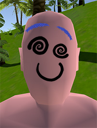
Epic Emotion Mega Mimic Ultra True Face HD©™
Remember the last post were I mentioned my humanoid model and its boring flat face?
There's a very good reason for that flat face!
Please let me proudly present my innovative Epic Emotion Mega Mimic Ultra True Face HD©™ system!

For that system I started drawing some funny little face parts here
IMG:https://stuff.unrealsoftware.de/pics/s3dev/face/faceparts_pre.jpg

(more to come!)

Surprise! These parts can be placed on the flat face! WOAH! Mind blown!
Not only that! ALL these parts can be FREELY positioned, scaled (including mirroring!), rotated and even color tinted.
This allows creating an unlimited amount of variation and really crazy looking faces.

My aim is to build a little editor and system which allows me to easily create different faces and maybe even facial animations.
Technically this is just a set of flat textured quads which are placed in front of the face mesh geometry with tiny distance to prevent intersections and flickering / z-fighting.

Note that the following samples are manually crafted for demonstration purposes (the implementation is not fully done yet):
IMG:https://stuff.unrealsoftware.de/pics/s3dev/face/shocked_pre.jpg
IMG:https://stuff.unrealsoftware.de/pics/s3dev/face/insane_rage_pre.jpg
IMG:https://stuff.unrealsoftware.de/pics/s3dev/face/confused_but_happy_pre.jpg


This is only the beginning! Eyes, optional eyebrows and a mouth are just the most basic elements.
There could also be red cheeks, scars, mustaches, pimples, freckles, tribal face paintings and much more.

What I won't add there though are noses. Noses look stupid.

Gradients And Terrain Textures
I'm using simple gradients to make transitions between sand and grass (and other terrain types) more smooth.
Well... this is what it can look like when you don't do the calculations right. No worries, already fixed that
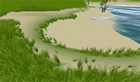
IMG:https://stuff.unrealsoftware.de/pics/s3dev/landscape/beach_gradient_gone_wrong_pre.jpg

Terrain textures on this shot are not final!

If you look closely however you can - with some imagination - see that grass and sand use different textures. This is already better than what Stranded II offered. In Stranded II there only was just one single detail texture and one color texture for different colors.

For Stranded III I now decided to write a simple shader which blends up to 5 textures using the vertex RGBA values:
• base: sand texture (visible if RGB is 0 / black)
• red: grass texture
• blue: rock texture
• green: grayscale detail/dirt texture
• alpha channel: color gradient. based on the alpha value a different color will be multiplied with the texture(s) which will be rendered

Stranded III in Unity Editor
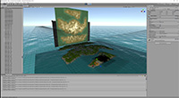
In case anyone wondered: This is what a Stranded III island with opened in-game console looks like in the Unity editor with wireframe on.
IMG:https://stuff.unrealsoftware.de/pics/s3dev/mapgen/island_in_editor_pre.jpg

The darker area where the wireframe is really dense is where the player/camera currently is. This area is rendered with higher detail.

I selected a terrain chunk (orange with arrows) to show that the terrain actually consists of many small meshes.

Another fun thing you can observe in this shot is that the in-game console with a 2D representation of the 3D map is visible in the background.
This is because the user interface actually consists of meshes as well and is therefore displayed in this editor view.
edited 1×, last 15.09.19 10:44:56 pm

old Icons & Random Map Menu

DC
Admin Off Offline

Quote
Multithreaded Terrain Generation
Random terrain generation can take a few seconds depening on your CPU and the island count and size.
Therefore I decided to move the random map generation to a separate thread. This way I can update a progress bar more or less fluidly while loading. This is great because moving stuff signals the user (and indirectly also the task manager) that the game did not crash.
I was actually suprised how easy it was to do that. I was lucky because the terrain generation is entirely data driven and doesn't use much Unity stuff. Many methods from Unity can only be used from the main thread. The only issue was the random numer generator from Unity that I used. It was possible to fix that issue by replacing it with the instance based random number generator from the .NET framework.

Don't get me wrong though! The terrain generation itself is still single threaded.
All I did is separating the terrain generation and the Unity main thread:
• Unity main thread: Renders a progress bar (and does internal Unity stuff)
• Terrain generation thread: Generates a terrain

A more advanced step would be to split up the terrain generation into multiple sub tasks which can be executed in parallel in multiple threads.
When done efficiently this could lead to a substantial reduction of the generation time on multi core CPUs (so basically on all modern CPUs).
Generation times are quite OK already though so I will keep it single threaded for now.

I also added a system which shows localized hints to the player while generating a random map

Icons
I have drawn some new icons and updated some old ones! Here's a selection. Note that they are much smaller in-game.

Settings, control and video
IMG:https://stuff.unrealsoftware.de/pics/s3dev/ui/icon_settings.png
IMG:https://stuff.unrealsoftware.de/pics/s3dev/ui/icon_controls.png
IMG:https://stuff.unrealsoftware.de/pics/s3dev/ui/icon_look.png


Map and dice
IMG:https://stuff.unrealsoftware.de/pics/s3dev/ui/icon_map.png
IMG:https://stuff.unrealsoftware.de/pics/s3dev/ui/icon_random.png


Some need some minor improvements (like fixing/adding drop shadows) but I'm quite happy with them.
For the dice and the cogwheel I painted over screenshots of 3D models in order to get the proportions right. The 3D model also helped a lot to get the brightness of the different sides right.

Random Island Creation Menu
Random island creation was very limited in Stranded II. It was very poorly implemented (resulting in ugly and boring islands) and you only had THREE (!) options when creating a map: Size, landscape type and game mode.
I now designed and partially implemented the random game menu for Stranded III. It will offer a lot more options to make the random island feature more fun.

> Random Game Menu on YouTube

Some explanations:

Random Seed
You can now enter a random seed. This is used by the random number generator to generate the game world. The same seed will always lead to the same result - if all the settings are equal as well.
This allows you to easily share your experience with others or to play the same experience again later.
You can also click the dice button to let the game generate another random seed.

Game Mode
The plan is to implement Lua scripted game modes in Stranded III.
What's still missing in the video is an additional button which opens an extra dialog for game mode specific settings.
This might be things like win conditions, start resources etc.
Some game modes may also disable/limit other parameters in the random game menu.

Spawn Position
This allows you to define where the player will be spawned.

Fixed Island Layout
When this checkbox is activated, you can manually place the island(s) on the map instead of letting the random generator do that for you.

Island Distances
If you do NOT use a fixed layout you can use this range slider to control the distances between islands.
The range slider is a new UI element which allows you to define two values at once. The random generator will pick a value in the specified range.

Islands
You can manually control how many islands you want to have on your map.
If you want the game to surprise you you can also choose the random mode and the game will decide if a specific island will be spawned or not.
Right now the menu is limited to 10 islands which is already quite a lot of data, especially when choosing big islands.
Therefore I may limit the amount of islands which can actually be spawned to something like 5 in future.
Having a list with more than 5 items here makes sense anyway because when using the random mode not all islands will be spawned. This allows you to define different islands of which some will be spawned randomly and some not.

A size range can be defined for each island.
Also you can specify the landscape type in case you prefer a flat landscape or want to see extra high mountains.

Additional per-island options which are not implemented yet are:

Biomes
This allows to control which biomes can or can't occur on an island. Maybe you will also be able to tweak the probabilities here.

Objects
Same option as for biomes for all objects that can be spawned on the map.
You could for instance blacklist all tigers if you're a coward.

Additional Island Settings
This will allow you to define an extra per island random seed (by default that seed is generated based on the map seed and the island number).
Moreover I will probably hide some additional fancy expert settings there.


Oh and I also plan to provide a preset system.
This will allow you to load, save and share random map configurations.
edited 2×, last 06.10.19 11:07:28 pm

old Random Spawning

DC
Admin Off Offline

Quote
More Icons
I recorded a video of me drawing new icons.
You can see that some of the icons are based on already existing items that I made earlier. I was forced to draw those again because I made the mistake to create them with only 32x32 pixels which is definitely not enough.
> Drawing Icons.

More Trees
There are only palm tree models as of now. I want to have jungle biomes as well though.
Therefore I started working on some jungle trees.
> Creating a tree model.

Aaand this is what it looks like when you add an unfinished and untextured tree model to the game and define a biome which only contains that object:
IMG:https://stuff.unrealsoftware.de/pics/s3dev/mapgen/untexturedtreebiome_pre.jpg

(click for larger version)

Beautiful. Somewhat looks like big mushrooms.

Finding A Random Spawn Position (attention: boring stuff!)
Time to explain some implementation details! Fun fun fun!
As you might have seen in my previous blog post there will be an option to define where the player will be spawned when creating a random map.
This option requires me to find a random position on the map which matches the configured conditions. How to do that?

The (probably) most naive approach would be the following:
• 1. Find a random spot (a random x and z coordinate generated with a random number generator)
• 2. Check if all requirements are met (e.g. is it sea, beach or land?)
• 3. if √ yes: cool, done!
• 4. if × no: start over (1.)

This approach is cool because it's very simple. It's easy to implement and it just works most of the time.
Correctly. Only MOST of the time. We can't guarantee that it always works because we might have a map which does not have any landmass at all (for instance).
Did you ever try to spawn a player on a beach which doesn't exist? It's a bad idea.

If you know something about programming you might notice that what I explained above is a loop.
The exit condition is step 2. We can't guarantee that this will be true at some point for all possible maps. Therefore we end up with something which must be avoided at all cost: An infinite loop.

The game will just keep checking random points forever. Never finding a valid spawn point.
This will result in a "the application does not respond"-kind of "crash".

A straightforward hack to tackle this issue would be to count the attempts and to stop at some point:
• 1. Find a random spot
• 2. Check if all requirements are met
• 3. if √ yes: cool, done!
• 4. if × no: increment a counter
• 5. If the counter exceeds a limit: Cancel (use a fallback position or show an error)
• 6. Otherwise: start over (1.)

This isn't a perfect solution though.
The points we pick are entirely random. Therefore it might happen that some points are never checked even with a high number of attempts. We might miss valid spawn positions!
Also we might do a lot of unnecessary work. Since the points are randomly chosen we may check the same points multiple times. That's bad and might make finding a valid spot slow (if step 2 is slow).

To optimize the algorithm we should try to check every point just exactly once:
• 1. start at the top left point
• 2. Check if all requirements are met
• 3. if √ yes: cool, done!
• 4. otherwise check if at bottom right point
• 5. if √ yes: all points checked! failed to find spawn!
• 6. if × no: go to next point (left to right, top to bottom order) and go to 2.

Okay cool! Works! But this isn't random anymore. We will always get the leftmost and topmost point that matches the conditions.

I can think of two subpar ways to bring back the randomness to the above approach:

• Shuffle before iterating:
We could store all the points in a list and shuffle it randomly.
Afterwards we can check the points and return the first one that matches.
× Wastes memory because we have to store data we already have redundantly
× A lot of additional work for shuffling the data

• Store all valid points and pick a random one:
Instead of leaving the loop at step 3 we would just store all valid points in a list.
After iterating over all points we would just pick a random one from the list.
× We would always have to check ALL points just to find one random point.

Both solutions do the job but they also do a lot of useless work which is not needed.
Therefore I came up with a better solution:

Why not just start at a random point instead!?
This way we can check all points in sequence but since the starting point is random the result will be random too.
Also we don't need to do any extra work and we don't have to save a lot of extra data.
Even better: As soon as we find a matching point we can stop searching!

So this is the approach I'm using in more detail:
• 1. start at a random point
• 2. Check if all requirements are met
• 3. if √ yes: cool, done!
• 4. go to next point (left to right, top to bottom order)
• 6. if reached bottom right point go to top left point
• 7. check if at random starting point
• 5. if √ yes: all points checked! failed to find spawn!
• 8. if × no: go to 2.

Hooray! That's it! Congratulations for reading all this stuff. I didn't expect that anyone would do that. Are you interested in programming and/or solving problems? What do you think about my approach? Do you have other ideas how to find a random spawn point efficiently?
edited 1×, last 03.11.19 10:09:28 pm

old Editor Categories and Searching

DC
Admin Off Offline

Quote
Finding A Random Spawn Position 2
In my last dev blog post I described the algorithm I used to find random spawn positions for the player.
Did you notice that I just wrote used?

I asked about your opinion and actually didn't have any expectations. Turns out that some experienced and smart software engineering people are reading this blog!
Some readers found out that my approach is biased and also made me aware of things like LFSR and comparable solutions which generate a sequence of pseudo random numbers without any duplicates.
This is exactly what I needed and it's also a very useful tool which can help to solve various other tasks efficiently.
Therefore I rewrote my implementation using that fancy stuff.

Thanks a lot for all your comments!

Here's another cool link which was shared and which describes a simple use case for LFSR: Fizzlefade!


File Dialog
I implemented a file dialog. It will mainly be used in the editor whenever you load/save stuff.
It allows to navigate through folders, to select a file or to enter the name for a new file.
IMG:https://stuff.unrealsoftware.de/pics/s3dev/ui/filedialog_pre.jpg

> File dialog (click for bigger version)


There are also some new icons:
IMG:https://stuff.unrealsoftware.de/pics/s3dev/ui/icon_drive.png
IMG:https://stuff.unrealsoftware.de/pics/s3dev/ui/icon_search.png


Map Editor
Stranded III will have more items, objects and animals than Stranded II. Therefore I have been working on smart ways to organize and easily access all these things in the editor.
I think I mentioned the possibility of defining categories a long time ago. These categories can even be nested. You will also be able to use categories in the map editor to easily find the things you're looking for.
This will look something like this:
IMG:https://stuff.unrealsoftware.de/pics/s3dev/ui/editor_categories_pre.jpg

> Nested categories in editor (click for bigger version)

You can click at any category on any nesting level. Clicking a category will limit the list of displayed objects to that category and all child categories.

If categories don't help you to find thing you can also use the new search function.
It allows to search things via the localized name or via their internal id by entering an "id:"-prefix in the search box!
Matching word parts will even be highlighted. Fancy!
IMG:https://stuff.unrealsoftware.de/pics/s3dev/ui/editor_search_pre.jpg

> Search (click for bigger version)

The search function works together with the category filter. This means that you can choose a category and then search within that category only.

Note that the icons for the objects are still missing in the above screenshots. This will be changed in future versions.
Categories can and probably will have their own icons as well.

The editor will also feature a random map creation menu which looks a lot like the random game menu.
It allows to easily create islands as a starting point which can then be modified.

old Map Editor & Map File Format

DC
Admin Off Offline

Quote
Short Distraction
Corona is all over the place unfortunately. I was fascinated by the numbers and at the same time frustrated that most pages did not show the information I wanted to see.
Therefore I spent some time with working on my own website related to that topic:
> CoronaCurve.de
It was a fun experience! I got to know Chart.js and the CSS framwork Bulma in this little experiment - which might be useful in future.

Most other info pages improved a lot by now and provide more detailed information than I do on my little page.
I can't (and don't want to) keep up with that so I promise that I will focus more on Stranded III again
In other words: There are no plans to put more time into CoronaCurve.de!

Map Editor
Back to the actual topic of this blog: Stranded III! There's some progress with the map editor!
You can now transform the terrain with tools. This includes changing height and textures.
When changing height you can (un)tick a little checkbox which controls if the terrain colors should be automatically adjusted based on the terrain height and steepness.
I recorded a little video to demonstrate what that looks like.

> Watch the map editor preview video on YouTube!

Please note:
• The editor is unfinished and so are the assets. Some models and textures will be changed in future.
• There are no LOD models yet to be displayed for far away objects. That's why stuff just disappears in this video.
• There are supposed to be preview images in the object list. Those are currently broken / not properly configured.
• The items are not properly configured in this video (ugly shiny material properties and weird colliders for physics)!
• Terrain normals are not calculated yet, making the terrain look very "unshaded" and flat

Map Format: Storing Heights (warning: technical stuff ahead!)
I also worked on improving the map format. It's a binary format with a lot of little tweaks which help to minimize the file size of maps (and save games as well).

In these days CPUs are really fast. Therefore the bottleneck when working with files is almost always the physical storage (HDD or SSD). It's still a very slow operation to read/write data (in comparison to other tasks that happen on the CPU/GPU directly).
SSDs are much faster than HDDs for sure but there's that issue with limited write cycles. Therefore I want the map files and save games to be as small as possible.

Maps in Stranded III are stored as chunks. One chunk has a size of 64x64 meters.

When storing a chunk I analyze all the terrain heights of that chunk and determine the lowest and the highest height.
Then I calculate the biggest height delta. That's simply:

delta = highest - lowest

Example: If the highest point on that chunk has a height of 5.13m and the lowest has a height of 3.02m then it would be
delta = 5.13 - 3.02 = 2.11

I decided (for now) to save the terrain with a height precision of 1cm. That's a pretty high precision in my opinion. Maybe I will reduce that a bit in future.
Based on that precision and the delta on the chunk I can determine which data type I use to store the height.

With a 1cm precision I can use a single byte (8 bit) per height value if the height delta on that chunk is 2.55m or below (a byte can store values from 0 to 255).
To do this I write the min height of the chunk and then I write the deltas of that min height and each point in the chunk as bytes.
Of course there's also a little (byte) flag which denotes that the heights of that chunk are stored in bytes. Otherwise I wouldn't know how to load it.

If the deltas are 655.35m and below I can use an unsigned short (16 bit = 2 bytes) to store the heights. In practice this is nearly always the case.
If they are above that I have to use an unsigned int (32 bit = 4 bytes). That's enough to cover even the most insane height deltas (42,949,672.95m). I don't go beyond that.
A further optimization here would be to use a 3 byte data type (24 bit, 167,772.15m) instead of directly jumping from 2 byte to 4 byte precision.
I didn't do so yet simply because this data type is not directly supported by C# and I need to implement my own read/write methods for that first. That should be quite easy though so I'll surely add it later

When testing this with real procedurally generated maps I noticed that the single byte precision was never used. This means the height delta was always above 2.55m on a 64x64 area (which isn't a big surprise at all).
Therefore I added another level of optimization: If the byte precision storage method can't be used on a chunk that chunk is split. The sub chunks will have a size of only 4x4 meters (16m²) each.

For every sub chunk I do the very same thing I did for chunks: Find min, max and delta and check which data type can be used for storing them.
Since the sub chunks are much smaller it's much more likely that bytes can be used to store the heights. This helped a lot to further reduce the map size.

Why 16m² for sub chunks? Each (sub) chunk requires 5 additional header bytes (the min height and a byte for the used data type). Therefore it doesn't make sense to make them too small.
They also can't be too large because then the height deltas would be too high for using single bytes.
I did some tests and it turned out that 16m² leads to the smallest map files.

Finally I use the gzip algorithm to compress the whole thing.

There is still a lot of room for further optimizations but I'm already quite happy with the current solution
Stay healthy!
edited 1×, last 02.05.20 01:55:10 am

old Plant Stuff

DC
Admin Off Offline

Quote
Reed
I made some reed models! Hooray! Here's one of them:
IMG:https://stuff.unrealsoftware.de/pics/s3dev/models/reed_pre.jpg

Fun fact: Unlike most plants in the game this reed model is entirely opaque and does not use any alpha transparency.

Grass
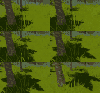
I worked on the grass and replaced the old grass texture and model with a new one.
The new texture isn't that thick (separate narrow blades of grass) and therefore blends better with the terrain texture.
I also took that opportunity to improve my custom grass rendering system which now supports multiple different grass models and materials.
IMG:https://stuff.unrealsoftware.de/pics/s3dev/landscape/grass01_pre.jpg


You can also see on that screen that I'm experimenting with the HUD design again...

Planet Zoo Inspiration
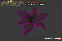
I saw the Planet Zoo: South America Pack trailer and I really liked the plants there. Especially that little pink/magenta one which adds some nice variety to the scene which mainly consists of different shades of green.

Therefore I made my own version of that model for Stranded III (there's actually also another variant with less leaves).
IMG:https://stuff.unrealsoftware.de/pics/s3dev/models/magenta_plantlet_pre.jpg


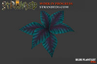
And because it's much fun to recycle stuff I made another version of that plant which looks a bit stripy and is blue:
IMG:https://stuff.unrealsoftware.de/pics/s3dev/models/blue_plantlet_pre.jpg


Moreover I got some awesome feedback for the map file format and further iterated on it to make it even better Thanks again for your comments!

old Lots Of Random Things

DC
Admin Off Offline

Quote
Website
I had to move to another webserver in June which is why I wasn't able to focus on Stranded III during that time.
We now have HTTPS though! Hooray! That upgrade was long overdue.
If you notice any issues with the website (e.g. broken links or images) please let me know!

Fog And Post Processing
I fine tuned fog and post processing effects. I think stuff looks much better now.
Of course these settings can be changed so the game looks (and hopefully performs) well on your system.
Here are some impressions:

IMG:https://stuff.unrealsoftware.de/pics/s3dev/landscape/palmtrees01_pre.jpg

IMG:https://stuff.unrealsoftware.de/pics/s3dev/landscape/palmtrees02_pre.jpg

IMG:https://stuff.unrealsoftware.de/pics/s3dev/landscape/trees01_pre.jpg


I'm using various standard Unity post processing effects like bloom, depth of field, screen space ambient occlusion and motion blur.

Diary aka Questlog
There will be a diary again.
It will work like the Stranded II diary but this time it will have 5 sections:
√ current quests
√ finished quests
√ failed quests
√ notes
√ encyclopedia

Quests will be used for the story. You can finish them but you might also fail to finish them. E.g. when there is a time limit or if there are different quests for the same task which just offer you different approaches to solve that task.
There are also notes which also can be used for the story and other stuff. The difference between notes and quests is that notes are not connected with any task.

My plan is to also add some quests to random maps.
These will be connected to special objects, characters or events which are randomly spawned on the map.
This should help to keep random maps more interesting over a longer period of time. Some quests and events may only take place after surviving a certain amount of days or after building a certain thing.

Encyclopedia
Why should I implement actual game play if I can waste time with implementing useless subsystems?! Yaaay!
I implemented a very simple encyclopedia system. It is entirely based on localization data and does not require any additional definitions.
You can simply define language keys with a special prefix/suffix to create new encyclopedia entries. There are even categories!

This is what the localization entry for a category looks like:
1
enc_stuff = Fancy Stuff
It creates the category stuff with the localized name "Fancy Stuff".
That "enc_" thing is a prefix which tells Stranded III that this is an encyclopedia category.

An entry for the encyclopedia requires 2 entries: A title and the text for the entry.
The title looks like this:
1
enc_stuff_rock_title = Rock

... and the text like this:
1
enc_stuff_rock_text = Rock and roll! Better don't try to eat this. Might be useful for crafting though.

That's it! We made an encyclopedia entry which can be looked up in the in-game encyclopedia!

Encyclopedia entries are invisible in the beginning. They need to be unlocked.
This will be possible via scripts. I did not implement this part yet but it will look something like this:
1
UnlockEncyclopedia("stuff", "rock")
A simple 2 paramter method which needs to receive the category and the internal name of your Encyclopedia entry.
The second parameter will be optional to unlock an entire category at once.

Encyclopedia unlocks are for the entire game and not just a session.
So if you start a new adventure you will keep all your Encyclopedia unlocks from previous play sessions.

The UI will also give you a percentual overview over how much stuff you already unlocked (in total and for each category).
This will give you a nice idea of how much content of the game you already discovered.

Surface Alignment
Objects on the terrain are now properly aligned to the surface.
You can define for each object how much it will be tilted depending on the terrain surface.
The value can be anything between 0.0 (0%) and 1.0 (100%). Some example values:

• min: 0.0 = 0% = Terrain steepness is ignored. objects will be upright to an imaginary plane surface.
• 0.5 = 50% = objects will be "50% perpendicular" to the terrain surface. So if the terrain has a steepness of 50% (diagonal), the objects will have an angle of 45° * 0.5 = 22.5° on the related axis
• max: 1.0 = 100% = objects will be 100% perpendicular to the terrain surface (50% steepness = 45° angle).

This allows me to make the generated world look more authentic.
While small plants can be fully influenced by steepness (100%) it makes sense to choose a much lower value (like 0%-30%) for big trees because those tend to grow upright.
Otherwise forests would look like there was a big storm recently which uprooted all the trees.

Fun fact: This is what it looks like when you DON'T get your surface alignment math right (and yes, I needed some attempts to get it right):
IMG:https://stuff.unrealsoftware.de/pics/s3dev/terrain/badsurfacealign_pre.jpg


Random Map Generator UI Progress
This is nothing super exciting but I also finished two new dialogs related to the random map generator.

The biome selection allows you to choose which biomes can be part of an island (this is a per island setting)
IMG:https://stuff.unrealsoftware.de/pics/s3dev/ui/rgen_biomes_pre.jpg

Note that biomes listed there are subject to change (like everything posted here).
The used dialog is an all-purpose solution. A list of checkboxes.

The entity list allows you to blacklist objects you don't want to have on your island (also per island)
IMG:https://stuff.unrealsoftware.de/pics/s3dev/ui/rgen_entities_pre.jpg

It even support filtering via a search input field and via category combobox/dropdown. Fancy stuff, right?!
That way you can easily and quickly find what you're looking for.

This dialog is of course much more specialized than the other one but it might also be used in some other places. Probably in the map editor when you have to select multiple entity types for some reason.

old Stuff In Hands

DC
Admin Off Offline

Quote
Stuff In Hands
Stranded II didn't have it, Stranded III will have it: Visible equipment in your hands.
Doing something supposedly simple like this in a first person 3D game comes with some technical problems.

Let's assume the player is wielding a hammer.
Of course we want to see that in first person!

The naive approach would be to attach the hammer to the first person view camera.
That way it will move and rotate with the camera. Exactly what we need. It's stuck directly inside the camera though which doesn't look very nice. Therefore we add a small forward offset (in view direction).
Voila! That works! Add some fancy animations and we're done! Right?

Nope

Yes, it does work and all looks fine but as soon as you move close to another object you'll see that parts of your hammer disappear within that object.

That just looks wrong and doesn't make sense.
The problem happens because I do not have any extra colliders on the hammer. It's a purely visual element and it has to be like that. Otherwise you could get stuck while rotating the player which would be really horrible.

Luckily there are many ways to fix this issue:

• A second camera which only renders your hammer and which is rendered after the normal game scene
• A special shader which tells the engine to render your hammer after everything else (ignoring the z-buffer which is typically used to define render order).
• Make the collider of the player/other objects so big, that the player can't get too close to other objects
• Render the hammer into a render texture and show that as UI (or display it on a plane)
• Make the hammer tiny and move it very close to the camera

I tried the second camera approach but I didn't manage to make it work with Unity 2019 and the v2 post processing stack.
Rendering a second camera with a transparent background is probably nothing the Unity devs thought about when implementing the post processing - or I was just too stupid to find the right way to fix it.
It worked without post processing effects but I already put quite some time into the post processing stuff and I don't want to remove it. Therefore I discarded that solution.

The special shader is not an option either because it would be annoying and/or limiting. Having to make an extra shader for each shader used in equipment items is not cool.
Same for the collider workaround.

I'm pretty sure that the render texture approach would have worked but it's not a nice solution.
Especially because it would require an additional huge texture in memory and an additional render pass. Therefore I didn't even try to do it that way.

Instead I chose the last option. I made the tool tiny and moved it closer to the camera.
This solution is cheap (no additional texture, no additional render pass) and also very easy to implement.
Just divide the hammer size by X units and at the same time move the object X units closer to the camera. There is no visible difference.
The only thing I had to take care of was the near clipping plane of the camera which cuts off stuff which is very close to the camera. Luckily Unity allows to adjust the distance of that plane.

IMG:https://stuff.unrealsoftware.de/pics/s3dev/ui/wieldhammer_pre.jpg

That's the result. Do you see that the hammer is actually tiny?! I hope you don't!

Note however that this solution isn't 100% perfect. If you're really close to something with stupid geometry/colliders (or no colliders at all like foliage) the wielded item may still intersect. I think it's good enough anyway.


Building Menu Images
I have drawn some icons for building categories. This is nothing special and I worked on a lot of other things as well but sometimes it's not easy to find stuff which can easily be shown/explained in the dev blog.
IMG:https://stuff.unrealsoftware.de/pics/s3dev/ui/buildingmenu_pre.jpg


Oh.. and of course you can't build plants or animals. Don't get that wrong!
You can however build stuff FOR plants or animals. E.g. a herb garden or a stable.

Starting Equipment
When you play a custom game you will also be able to choose custom starting equipment! At least in some game modes.
To make that possible I extended the entity list dialog (mentioned in the previous blog entry) and added an option to also enter amount values in little textboxes right in the list. How convenient!
IMG:https://stuff.unrealsoftware.de/pics/s3dev/ui/startequipment_pre.jpg

After implementing this I noticed that you easily missclick and remove the entry directly instead of focusing the text input field which is very annoying.
Therefore you now have to confirm removal in a little context menu.
edited 1×, last 12.10.20 09:09:36 pm

old Time

DC
Admin Off Offline

Quote
Disclaimer: Warning! Boring blog post without ANY picture ahead!

Time
I worked on a lot behind the scenes stuff recently.
One of the topics I took care of was time. More precisely what I call the "game time" which measures exactly how long you played. Time is very important because it starts/stops a lot of things in the game.
E.g. when you have a "bleeding" status effect it will reduce your health by X every Y seconds.

In Stranded III you can perceive the expired game time in two ways:
• There's a visible day and night cycle which heavily influences the game play (because at night it's hard to see stuff etc.)
• I also decided to add a visible timer to the in-game menus. So whenever any in-game menu is opened you can see the current time.

That timer will help you a lot to plan your day (and night) more efficiently while playing. It also shows you how many days you survived.

Time Factor
Game time is measured in real time seconds internally. This means one real second also increases the game time by one second. The displayed time however comes with a factor because playing in real time would be too boring. You would have to play a whole day to experience a full day night cycle. Nobody wants to do that! I'm still experimenting to find a good factor for Stranded III.

Here's how long a day - a full day and night cycle - takes in some games (can't guarantee that all of those are really correct):
• Minecraft: 20 min (72 * real time)
• Gothic (one of my favorite games): 96 min (15 * real time)
• Stranded Deep: 40 min (36 * real time)
• Terraria: 24 min (60 * real time)

Doing it like Terraria where one real minute is exactly one game hour is very tempting because it's so straightforward.

Time Precision (Technical)
When you're a software engineer and you have to measure or save something, one of the first questions which comes to your mind (or should come to your mind) is: Which data type should I use?

Interestingly enough Unity decided to go for a regular 32 bit floating-point (aka single-precision floating-point).
That value is in seconds so the decimals are required to express split seconds.

This is an acceptable approach but it comes with problems due to the way floating-point numbers work internally:
The farther the value is away from 0 the lower the precision! Oh no!
So when your game session doesn't take too long, everything is fine. You have quite a good time precision which is absolutely essential for games to work properly.
If your session takes longer however the precision starts to fade. This in return can make the game entirely unplayable.
Here's a post from a person who made a nice table about 32 bit floating-point precision.

Example 1: Playing for one day
A day (24h) has 24*60*60 = 86,400 seconds.
When you are using 32 bit floating-point and play for 24h, time precision will only be ~10 milliseconds (~0.01 sec).
That's already a lot in gaming if you consider that a single game frame with 60 FPS takes just 1,000 / 60 = 16.666 ms = 0.0166 sec.

Example 2: Playing for one week
A week is 7 * a day so it's 7 * 86,400 = 604,800 seconds.
According to the table this leads to a precision of only ~60 milliseconds (~0.06 sec).
Depending on where and how floating-point numbers are used, this is definitely enough imprecision to entirely break a game.

I found a very nice article explaining the issues with that in detail.

So the solution to the issue is to either use double or long (both twice as large, 64 bit) as data type for time values.

When saving the game however I will only store the absolute game time as double.
All other game time related values will be stored as 32 bit floating-point values with the game time subtracted to save memory.

E.g. there is a timer which is set to expire in five seconds. So it is set to
1
expirationTime = gameTime + 5f

Now instead of saving that (possibly huge) number as double, I only save gameTime once with the save game (as double) and subtract gameTime from expirationTime (so that it is just 5 again):
1
storedExpirationTime = expirationTime - gameTime

That way I can store it as float because it's a much lower value now.
When the game is loaded, I simply add the stored gameTime value again to get the old value:
1
expirationTime = storedExpirationTime + storedGameTime

32 bit saved! Huge success!
Doesn't sound like much but it makes a difference when you have a lot of time values.
Oh and of course gameTime also has to be set to storedGameTime when loading a game. Otherwise stuff would explode in horrible ways.

old Neatly Aligned Pottery

DC
Admin Off Offline

Quote
Immersion: Visible HUD
I played some Stranded Deep recently (only for research of course). What I like most about it is that it looks really good.
It's also nice how they managed to make the game work without any HUD (heads-up display). There is no visible health bar for instance. Instead there's a funny button which makes your player character look at their watch. That watch then displays all relevant values. It also beeps when something important happens.
Having no HUD at all is great for immersion but I think it's not worth it. You have to (or want to) look at the watch so often that the tiny extra step of hitting a button becomes are nuisance quickly.

When working on UI/HUD for Stranded III I asked myself if there should be a visible HUD.
As you can guess from the previous paragraph I decided to have one. It's simply better for game play if you see all relevant values directly without having to do any extra work.
Sure, there are ways around this like special visual effects or sound effects when certain values reach critical levels but I still have the feeling that I really want to see the actual values.
Therefore they will be there. Always. BUT you will be able to change this with a setting. If you want to you can hide them and only show them when a menu is opened or when something important happens.

User Experience
A huge problem I faced while playing Stranded Deep was usability. The inventory is quite minimalistic. It's one of these fancy circle menus which allow you to quickly select stuff with your mouse. Many games use that kind of menu. I guess that's because it's an easy way to present a good number of options and it works well with mouse and controller.
The problem is that - in my opinion - this kind of menu is too limited for an inventory. Especially in a survival game where items are super important and used frequently. You can't have many item slots in it because otherwise it would become too difficult to accurately select items (A circle can't have more than 360° and sections can't be too small).
I think one consequence of this limitation is the annoying stacking behavior in Stranded Deep. You can stack items of the same type but the "state" of the item doesn't matter. In practice that means that - for example - raw, cooked and rotten meat is put into the same slot. You can switch through items in the stack in awkward ways but they all look the same and you have to carefully read what it is. Therefore it happened quite often that I ate raw or rotten meat even though I had freshly cooked meat in my inventory.
In general Stranded Deep does a bad job at explaining how things are controlled. It took me a while to figure out how to drop items which are in the inventory. It's still in early access though so maybe they will improve that.

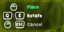
I noticed that a lot of other games display how stuff is controlled. Permanently and by default. I think this is a simple but still good approach because it's super frustrating to fail only because the controls aren't clear. It's worth to sacrifice some space in the UI if the alternative would be that players quit because they are frustrated.
One good example for that is Grounded which shows key combinations like everywhere.

Therefore I want to display more and better control infos in Stranded III as well and worked on a fancy UI system to make that possible.
It allows to show mouse and keyboard input options with up to two keys (either as alternatives or combinations) per action. It also automatically shows the keys defined in the settings. At least if there is a setting. A few things don't have settings and can't be changed (e.g. Escape for closing stuff).
I can also highlight options if they are the most important ones or make them a bit darker.

Here's an example:
IMG:https://stuff.unrealsoftware.de/pics/s3dev/ui/controlsinfo.jpg


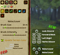
The new system is also used in the editor where it replaces the ugly old plain text instructions:
IMG:https://stuff.unrealsoftware.de/pics/s3dev/ui/controlsinfo_oldnew_pre.jpg

> Click for bigger version


I also took the opportunity to extend the displayed keys so the users also knows how to move and look around in the editor.

That little info panel has been removed from the left sidebar and now sits in the bottom right corner of the screen.

New Editor Features
I've also worked on the editor!

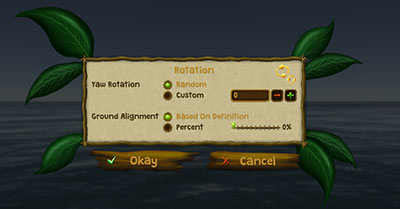
The rotation stuff with ground alignment is something I mentioned earlier. You now have full control over that kind of stuff
IMG:https://stuff.unrealsoftware.de/pics/s3dev/ui/editor_rotation_pre.jpg

> Click for bigger version

• Yaw rotation: The rotation (around the Y-axis) when placing objects. By default it's random and changes each time you place an object but you can also define a fixed standard angle.
• Ground Alignment: I wrote about that in Dev Blog #94 (Section "Surface Alignment"). Controls how much the object is "tilted" depending on the steepness of the surface.

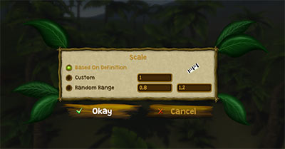
Now there's also new menu which allows you to control the default scale when placing objects:
IMG:https://stuff.unrealsoftware.de/pics/s3dev/ui/editor_scale_pre.jpg

> Click for bigger version

• Based on definition: The definition defines the scale. That's the default behavior. The definition can either define just a fixed value or a random range.
• Custom: A fixed custom scale factor.
• Random Range: A random scale factor between the two given values. Each time an object is placed a new random factor is chosen.

It's important to note that these menus are just used to control the defaults which are used when placing new objects.
Of course you can also freely modify scaling and rotation while and after placing objects.

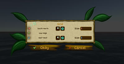
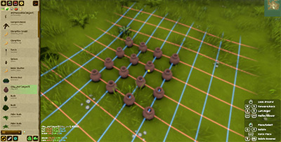
Moreover there's a grid!
IMG:https://stuff.unrealsoftware.de/pics/s3dev/ui/editor_grid_pre.jpg

> Click for bigger version

• The grid can be displayed in entity placement mode on X- and/or Z-axis (eye buttons)
• You can enabled/disable "snap to grid" for X- and Z-axis separately (# buttons)
• You can modify the grid size on X- and Z-axis separately

In the first iteration of that menu I also had a grid for the Y-axis (height) but I decided that this doesn't make much sense since height is commonly defined by the terrain.
That option might come back later depending on how things evolve but right now there is no real use for it.

Here's a super realistic, ultra exciting an mind blowing use case scenario for the grid:
Neatly aligned pottery. 4x4. Welcome to OCD heaven*.
IMG:https://stuff.unrealsoftware.de/pics/s3dev/ui/editor_aligned_pottery_pre.jpg

> Click for bigger version


*) Ooops.. please ignore the little yellow cursor dot which is NOT IN THE CENTER. There is no center in 4x4. At least not with "snap to grid" enabled. Sorry. I didn't want to ruin your day.

old Growing Cycle

DC
Admin Off Offline

Quote
Banana Plants
It's time for some models again! I already had a single banana plant model but I now added a few more variants for the different states. To be able to do so I had to do some research first and learned a lot about banana plants. The resulting models are very far away from being botanically accurate but they are much much better than the ordinary banana plant in Stranded II which just spawned single bananas every few days and which did not look much like a banana plant at all.
IMG:https://stuff.unrealsoftware.de/pics/s3dev/models/bananaplant_variants_pre.jpg

> Click for bigger version


1. young plant
2. medium plant
3. fully grown plant
4. starting to bloom
5. banana start growing
6. ripe bananas

The screenshot is maybe a bit misleading because of the badly chosen viewing angle. Ooops. Plants 3 to 6 have exactly the same size.
Once the bananas are ripe (6) you'll have to harvest them all at once which will also reset the state of the banana plant (to 3) and initiate a new growing cycle for the next fruits.

Having mutliple models for different plant states is complex, much work and requires slightly more (V)RAM.
I will only do so for some selected/important plant types. Especially for stuff which can be harvested and were it is important that the player can easily see the current status.
For most other plants I will use simple methods like scaling and coloring to represent the different states. Just like I did in Stranded II already.

Pumpkins
Same procedure for the pumpkins! I made 4 new models for the plants.
They work a bit differently: Once harvested the plants are completely gone. If you want more pumpkins you have to plant more of them!
IMG:https://stuff.unrealsoftware.de/pics/s3dev/models/pumpkin_variants_pre.jpg

> Click for bigger version


From left to right:
1. young plant
2. blooming plant
3. pumpkins start to grow
4. ripe pumpkins

By the way: I use one texture for all growing states of a plant. This increases rendering performance and lowers video memory requirements.
IMG:https://stuff.unrealsoftware.de/pics/s3dev/models/pumpkin_texture_pre.jpg

> Click for bigger version


Merry Christmas
That's it for now! My plan is to use the free days to work extra intensively on Stranded III. Let's see what I can do!
Thanks to all of you for reading this blog and following Stranded III's seemingly eternal development.
I wish you all a merry Christmas and a happy new year! Stay healthy!

old Controller & Ghosts

DC
Admin Off Offline

Quote
Character Controller
It's cool that Unity has a CharacterController but unfortunately it's quite limited (a character controller is used to move characters in the game world. Either based on user input or based on AI decisions).
Until now I've been using it for the player and it was okay. I also wanted to use it for AI controlled characters like wild animals but I quickly encountered weird behavior.
There seems to be no practical way (except for weird and dirty hacks) to prevent that character controllers can step on each other. I don't want animals to form stacks like the Town Musicians of Bremen. It looks weird and it would possibly allow them to overcome obstacles which they normally shouldn't be able to pass.
Moreover there are some other limitations which can't be controlled properly. Therefore I wrote my own character controller which gives me full flexibility and freedom. If it does weird stuff it's my own fault and I can hopefully fix it. If Unity's character controller does weird stuff I'm rather helpless because I don't have access to its source code.

Writing your own character controller is a surprisingly complex journey. My approach works now but it's still very limited.
Unity offers some nice functions like RigidBody.SweepTest or Physics.ComputePenetration but they all come with annoying limitations and issues.
Why do you need an instance of a rigidbody to do a sweep test? Why does the sweep test ignore colliders when you're already colliding with them? Why can't I test if two convex mesh colliders collide?
I understand some of the reasons behind these limitations but it's very annoying and time consuming to work around them.

Therefore I ended up with just doing a ton of raycasts to check for collisions.
I believe that this is what Unity's character controller also does internally.

Building Ghosts
When placing buildings you need to see what it will look like when they are finished.
Most games use so called ghosts to visualize unfinished buildings or buildings which are being placed. I guess they are called like that because they have no collision and because they are transparent in most cases.
I found a cool shader which is actually intended to render glass. I modified it a bit and now it's the perfect shader for my ghost buildings.

Placing a palisade wall:
IMG:https://stuff.unrealsoftware.de/pics/s3dev/buildingghost.gif

The ghost turns red when you can't build in the chosen location. If the location is valid you'll see a green ghost.
Note that the palisade wall seems to jump because an optional building grid is enabled.
The shadows move quicker than usual because I increased time progression speed for testing purposes.

Placing a camp fire:
IMG:https://stuff.unrealsoftware.de/pics/s3dev/ghost_campfire_pre.jpg

> Click for bigger version

old One Hundred

DC
Admin Off Offline

Quote
ONE HUNDRED
IMG:https://stuff.unrealsoftware.de/pics/s3dev/100_pre.jpg

> Click for bigger version


Dev blog number 100! Wow! The first blog entry was in August 2012. It's April 2021 now. Ooops. That's nearly 9 years.
Thank you for still following this blog! I actually wanted to do something special for blog entry number 100 but I didn't manage to finish anything special so... nothing special today. I still wanted to post something so you know I'm still alive.

Keep It Simple: Definition Inheritance
I mentioned that fancy definition inheritance feature in one of the previous dev blogs.
The thing is: Inheritance is super useful (given that people understand how to use it) but it makes things more complicated to understand and comes with several new problems. E.g. when using inheritance you have to ensure that you also include the (abstract) base classe(s) your definition(s) inerhit from when you share them with others or when you take them to put them in your new mod.
Therefore I decided to entirely scrap that feature. Sorry! It's better that way. A nice side effect is that it makes the definition parsing code simpler and maybe also slightly faster.

Unity 2020
Unity version 2020 is now a stable long term support (LTS) version. So I switched to it - without any major problems.
Fun fact: Do you remember my blog about time and how I questioned Unity's decision to use floats for time values?
They fixed that and introduced double precision values. They even recommend to use them instead of the old float ones!

Moving Sunlight And Shadows
I have the feeling that Unity 2020 performs much worse when I move my light source (the sun) than Unity 2019 did. Might also be just a new/changed setting. Not sure. I didn't find a reason yet.
To handle that problem I now implemented what many games with a day/night cycle do: I don't move the sun every frame or every few frames anymore. Instead I move it once quickly every X minutes (actually every game time hour right now). That way there is no constant performance impact caused by light calculations.

Here's what I mean (time elapses faster in this gif for demonstration purposes):
IMG:https://stuff.unrealsoftware.de/pics/s3dev/movingshadows_pre.gif

> Click for bigger version (3.4 mb)


Other games do it the same way and I'm pretty sure it's for performance reasons too.
edited 1×, last 15.08.21 11:14:10 pm
To the start Previous 1 2 3 4 5 6 Next To the start
Log in to replyProjects overviewForums overview